Wise Circulation Redesign
Overview
The Wise Console is a modern, cloud-based library management platform built to replace the legacy Wise Client—a desktop-based system.
When I joined the project, foundational features like customer management and catalog functionality had already been migrated to the new platform. However, several major workflows—including acquisitions, point of sale, configuration, and circulation—had yet to transition.
Circulation and hold fulfillment were next on the roadmap. I was brought in to lead the UX design strategy for these workflows, to ensure the new experience would not only replicate the legacy system—but evolve it.
Goal
Reimagine the circulation and hold fulfillment experience from the ground up to:
Minimize unecessary steps
Accelerate task completion for library staff
Improve coordination across locations
My Role:
Senior UX Designer
Conducted a gap analysis to compare the old and new systems.
Performed a UX audit of navigation, workflows, and wireframes.
Interviewed & shadowed library staff to uncover pain points.
Partnered with product managers, engineers, and designers to refine solutions.
Led usability testing to validate design improvements.
Contributed to shared design system.
Timeline:
March 2022 - July 2024
Discovery & Research
Methods used:
An audit of the Legacy Wise Client and the new Wise Console build.
Review of Check-In & Check-Out wireframes.
Shadowing sessions with library staff at multiple branches.
Key Problems:
Too Many Clicks To Reach Key Tasks
Interface Overload
Outdated Printed Hold List
The system forced users to click through nested menus to reach daily tasks.
Early wireframes exposed too many options on screen at once, overwhelming users and increasing the risk of error.
Hold fulfillment relies on outdated printed lists by the time they’re used.
Defining the Strategy
I held an alignment workshop with the Product, Development, and QA teams to prioritize what changes would deliver the most value.
This exercise helped reframe the project not as a simple migration—but as an opportunity to rethink the experience around users’ actual needs.
From Insight to Concept
Before jumping into wireframes, I translated early research insights into low-fidelity task flows and layout sketches. We used “How Might We” questions to guide ideation, such as:
How might we reduce confusion when switching between check-out, customer, and catalog modules?
These quick visual explorations aligned the team early and informed the structure of our wireframes.
Wireframe Ideation & Testing
Design Focus
I created wireframes for three core areas of the circulation experience:
Navigation
Check-In & Check-Out
Hold Fulfillment Pick List
User Testing
We tested the wireframes with library staff from multiple branches and roles to validate usability, efficiency, and alignment with real-world workflows.
Design Iteration Highlights
Based on usability testing, we made several key improvements:
A horizontal tab navigation model was adopted to align with user expectations and reduce disorientation during task-switching.
Ensured that navigating away from the check-out screen returned users to their session until it explicitly ended—minimizing task disruption and reducing errors.
Optimized layouts to be mobile-friendly, making it easier for staff using tablets to search for and pull items directly from the shelves.
Evaluate: Navigation clarity in horizontal and vertical tab layouts
Evaluate: Task completion rate during check-in/out workflows
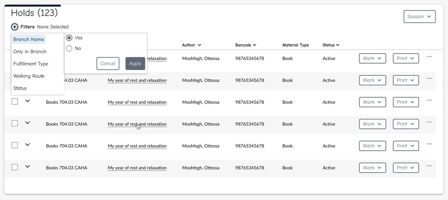
Evaluate: Effectiveness of the new pick list filters and live updates
Final Design Solution
Navigation Redesign
We moved from a dense, menu-heavy layout to a simplified tabbed structure aligned with how staff move through their day.
Before
After
Streamlined Check-in & Check-out
Simplified workflows with fewer steps and clearer visual hierarchy, enabling faster and more confident processing.
Digital Hold Fulfillment
Replaced printed hold lists with a dynamic, filterable pick list, updated in real-time to prevent duplication and support cross-branch coordination.
Design System Integration
To support long-term consistency and scale, I led efforts to establish a shared design system across the Wise Console platform. This helped unify design and development workflows while laying a strong foundation for future features.
Key Contributions:
Defined Core Components
Partnered with engineering to create foundational components—buttons, tables, inputs—and introduced design tokens for color, spacing, and typography.
Built a Centralized Figma Library
Created a reusable component library with 40+ documented variants, aligned with our React codebase to streamline design-to-dev handoff.
Established System Guidelines & Governance
Documented usage, accessibility, and behavior standards, and introduced a lightweight model for evolving shared patterns across teams.
Outcomes & Impact
Time Savings
Hold fulfillment time was reduced by 40%, allowing staff to complete tasks faster and focus more on patron service.
Improved Accuracy
Real-time updates significantly lowered errors and reduced the need for reshelving, leading to smoother coordination across branches.
Happier Staff
Library staff described the new workflows as “more predictable and way easier to manage,” resulting in higher satisfaction and greater confidence in the system.
Reflection
What began as a “lift and shift” turned into a full transformation. By embedding myself with users, listening to their frustrations, and iterating closely with the team, we delivered a tool that didn’t just digitize the past—it designed for the present and future.


